
2018 CAISSA Investment Review
2018 CAISSA Investment Review
by Kelly Pedersen, CFP®
This is my annual review of the markets for the year and where we might be going. It starts off with basic investment principals and gets more detailed about the economy, government spending and global markets at the end. Feel free to jump to the part that interests you the most. Enjoy!
2018 took us on a ride! The year started with a sharp dip, only to recover and grow. Going into September, the market was still hanging on strong even though interest rates had hiked a handful of times. Then in early October, the Fed announced that they thought the economy was doing a little “too well” and that they thought it might be necessary to hike rates an EXTRA two times. The market went nuts and scrambled for an exit… it wasn’t prepared for that news. Additionally, there were tense trade conversations going on with China and a tech market that was running exceptionally hot. From the market peak, we ended up losing about 20% to the trough on that frightful day of Christmas Eve trading (which makes it a Bear Market). At Caissa, we used this bottoming out as a perfect place to start for tax loss harvesting for clients that needed to offset large capital gains. With any residual cash we had, we put it to work! Since then, the markets have recovered about 12% on the S&P through mid-January.
As the fiscal year ended, there wasn’t a good place to hide. CASH was the best asset class to be in for the year which you can see from the chart below is rarely ever the case. According to JP Morgan’s Guide to the Markets, the average allocated portfolio (according to their allocation %) was down almost 6% for the year because, not only were stocks down, so were many bonds. While bonds were still helping stave losses the equities were enduring, bonds only contribution was their interest payment. This is because as interest rates payable on new bonds were rising, face value of bonds went down because there was now a new bond out there that paid more so yours was worth less. Additionally, if you had international equities (which you should), it dragged you down even more as they were the worst performing asset classes (down around 13-14%).
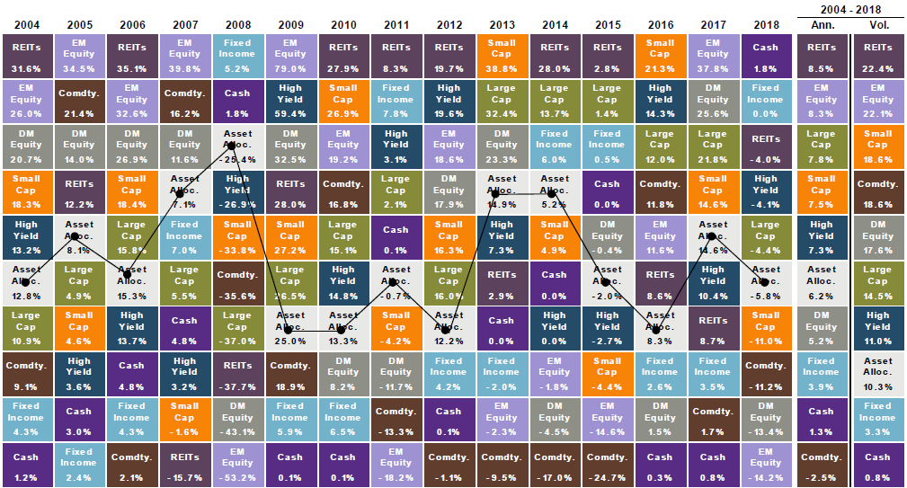
Source: FactSet, MSCI, Russell, Standard & Poor’s, J.P. Morgan Asset Management. Guide to the Markets – U.S. Data are as of December 31, 2018.
One of the better places to be was short term bonds, which is exactly where we at Caissa held the majority of our fixed income! Being in the vehicle of target date ETFs vs mutual funds helped mute much of the losses stemming from interest rate volatility since we can hold the bonds to maturity.
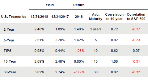
Source: Barclays, Bloomberg, FactSet, Standard & Poor’s, U.S. Treasury, J.P. Morgan Asset Management. Guide to the Markets – U.S. Data are as of December 31, 2018.
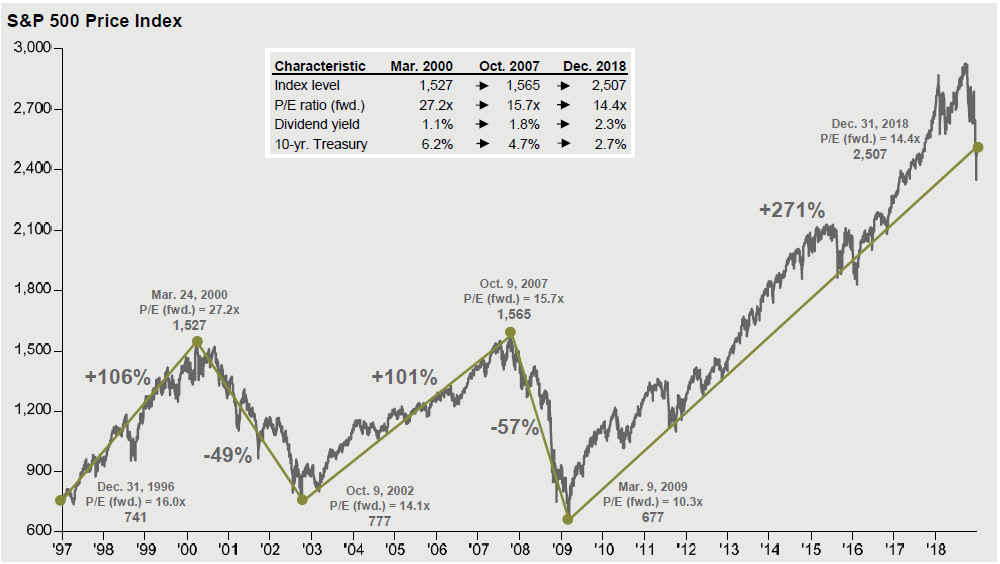
One of the reasons the latter part of the year felt so severe, and actually was severe, is that we were likely getting very complacent with positive returns no matter whether the news was good or bad that day. Typically we are supposed to have at least one intra-year downturn of 14% and a couple 5% dips. In 2017, we never had a downturn and we only had one itty-bitty 3% dip. It was well over a year since the market pulled back its reigns which makes the next pullback that much more sharp. And it was indeed.
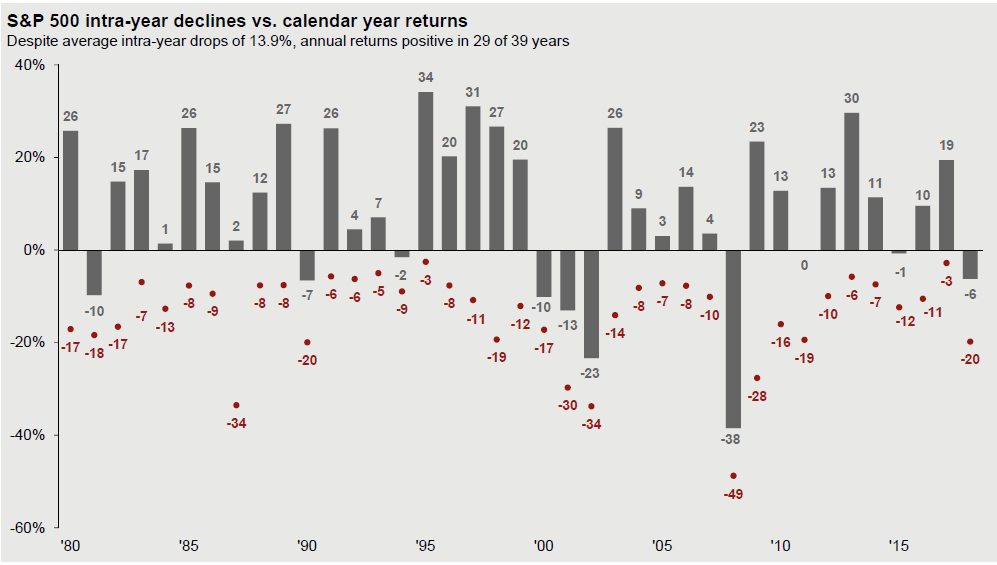
Source: FactSet, Standard & Poor’s, J.P. Morgan Asset Management. Guide to the Markets – U.S. Data are as of December 31, 2018.
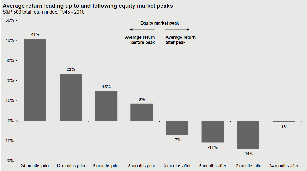
One of the things we talk to our investors about is the peak to trough to peak length. Once the stock market peaks to start a correction, it takes about 24 to 36 months to regain your investment. It can be a brutal time to be an investor. For example, the Great Recession downturn only lasted about 17 months, but most investors will tell me that they would have thought it was at least three years. Downturns make you feel terrible! Which is why you need a plan of action for when they happen.
Source: FactSet, Robert Shiller, Standard & Poor’s, J.P. Morgan Asset Management. Guide to the Markets – U.S. Data are as of December 31, 2018.
Like I wrote about in our Caissa blog a few months ago, a critical element in investing is managing emotions. In market times as we have been in for the past several years, when asked to look at the graph below of the S&P returns since 1926 and answer the question: “Are you a longterm investor that can weather the downturns and approach them as rebalancing opportunities?” It is REALLY EASY to nod and say, YES!
It’s easy because the entire ‘picture’ and perspective is there. The dips aren’t ‘felt’ and the ‘fear’ isn’t part of the anlaysis. It’s just clear, in hindsight, that if you are able to make a plan and stick to it, everything will be awesome! Right?
Source: Compustat, FactSet, Federal Reserve, Standard & Poor’s, J.P. Morgan Asset Management. Guide to the Markets – U.S. Data are as of December 31, 2018.
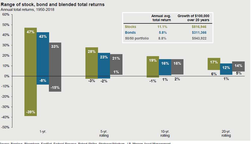
Our strategy at Caissa to avoid giving into fear at the worst time in the market is to practice our Tranches of Income strategy. If you are retired, we always have seven years of your “personal paycheck” (your withdrawals) set aside in safe investments so that you can weather any storm. The support for this is in the chart below (as well as my more in-depth explanation). If we look to history, a diversified portfolio has never had a negative five-year rolling return (additionally never negative for a 10- or 15-year rolling return either). The stock market itself (as indicated by the S&P 500) has had as much as a -3% return for a five-year rolling period and that reduces to -1% for the 10 year averages, while the 15 year rolling return for the S&P 500 market has never seen a negative rate of return.
This history gives us more support that having an investment plan than can sustain through at least five years will provide enough time for a market dip as well as recovery. Adding an additional year or two (like we do), adds to that level of security and allows our clients peace of mind knowing their personal paycheck will be safely provided for while the markets zig and zag. Having this strategy in place, they can ignore the noise and let us lean into and out of equities as we see opportunities arise.
Source: Barclays, Bloomberg, FactSet, Federal Reserve, Robert Shiller, Strategas/Ibbotson, J.P. Morgan Asset Management. Guide to the Markets – U.S. Data are as of December 31, 2018.
The “recession” word is getting thrown out a lot lately. One thing to keep in mind is that likely your recession fears are stemming from, and validly so, the Great Recession of 2008 where it was led by a great financial crisis. What we are seeing going into 2019 is that the next recession might be much more mild. What we’d call more of a ‘technical’ recession that is not driven by a massive crisis but instead signs of moderation in growth of the economy. As growth and technicals slow down in four or more areas for more than a few months, that is all it takes to become a “recession” (definition according to the NBER). It sounds scarier that it is because we just lived one of the worst recessions in history.
If you’re trying to predict the next recession, many people start with when the yield curve inverts. Historically, about 14 months after that there is a recession. While the inversion is a decent predictor AT the point of inversion, it’s not very useful until then. As you can see in the chart below, two of the nine times the yield curve inverted there ended up being no recession. Keep in mind, typically the market endures its worst performance before the recession happens. Right now the indicators are telling us there’s about a 21% probability of a recession in the next 12 months.
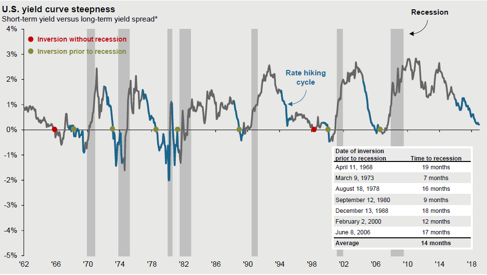
Source: FactSet, Federal Reserve, J.P. Morgan Asset Management. Guide to the Markets – U.S. Data are as of December 31, 2018
One of the things that could put us in a “technical” recession (my word…) is an earnings growth slow down. In 2018, Q3 earnings grew an average of 32% and as of Q4 that number was still hanging in there at 19% growth. This is fantastic growth! So it’s almost inevitable that we can’t sustain that growth forever and it will evidently slow. If earnings growth slows, it could technically cause (one of many) a recession. But one of the stats we are following from the consensus analysts is that while earnings growth may be estimated to weaken for a few quarters, it looks to pick right back up (see the green bars). If you are buying for forward growth (um, yes, we sure are), this is a good sign.
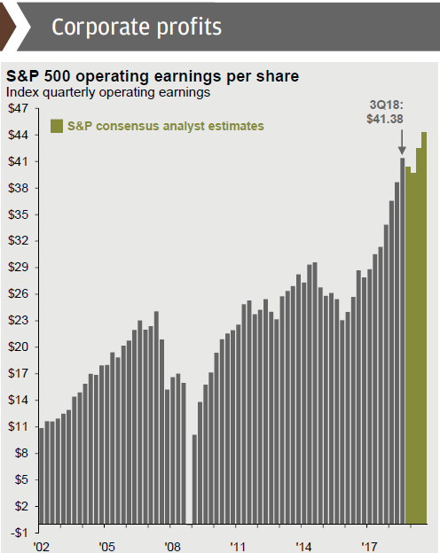
Source: Compustat, FactSet, Standard & Poor’s, J.P. Morgan Asset Management. Guide to the Markets – U.S. Data are as of December 31, 2018.
For years we talked about corporate cash being the highest ever on balance sheets. Now we can see what they have finally started to do with it. Capital expenditures since 2016 have ticked up from 0% to a very healthy 10%. Increasing dividends has not been a place where companies are utilizing their money but they are buying back stock at a rapid pace. Stock buybacks in 2018 were among the strongest ever. It’s a healthy sign that companies see the value in their stock that the market isn’t so they buy it back and then have less dividends to pay out in total as well as shrinking the ownership.
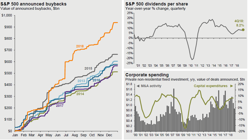
Source: Bloomberg, Compustat, FactSet, Standard & Poor’s, J.P. Morgan Asset Management. Guide to the Markets – U.S. Data are as of December 31, 2018.
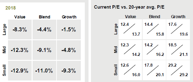
We have had a bias towards growth for the better part of a decade, and it has paid off in spades. We are always looking for the point the inversion might happen that pushes us back to more heavily weighting value. At this point, we are still having an overweight to growth but will keep analyzing for that conversion. Likely before a recession we may want to roll some of that over.
Source: FactSet, Russell Investment Group, Standard & Poor’s, J.P. Morgan Asset Management. Guide to the Markets – U.S. Data are as of December 31, 2018.
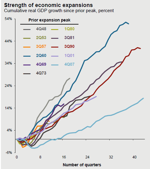
Switching gears to the economy as a whole. You have likely heard someone mention that the bull market it getting to be too long and it’s ripe to turn. We fully support the notion that bull markets don’t die of old age, they will get strangled by inflation. Per the chart below (focus on the light blue line), this recovery may be the longest, but it has also been the weakest. There was almost no expansion for about 16 full quarters. So where we sit today in valuations, we don’t believe we are over our skis just yet and think there’s still room to run.
Source: BEA, NBER, J.P. Morgan Asset Management. Guide to the Markets – U.S. Data are as of December 31, 2018.
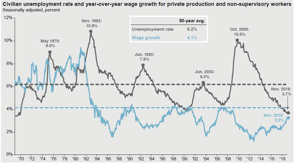
One would not think that record low unemployment numbers could cause the economy problems, but we believe that it will. The national unemployment rate is down to 3.7%. The 50-year average is 6.2%. This has led to wage growth picking up in a very real way for the first time in 10 years. We are currently at a 3.2% wage growth rate and in our opinion headed up even more. This wage inflation if it continues to accelerate can become a significant headwind for the U.S. economy.
Source: BLS, FactSet, J.P. Morgan Asset Management. Guide to the Markets – U.S. Data are as of December 31, 2018.
So what will kill this bull market? Inflation, debt or the tariff conversation? Let’s explore.
The Fed has a target rate of unemployment and inflation they want the economy to be near. In order to get there, they are telling us they need to raise interest rates to curb the growth that is happening, especially in wages and employment. Wage inflation can drive consumer inflation rapidly. In the blue of the chart below, the Fed is telling us they need to raise a few more times. The brown line is the market expectations indicating that the Fed pauses. This is a fairly wide divergence and a blink one way or another can send the market reeling.
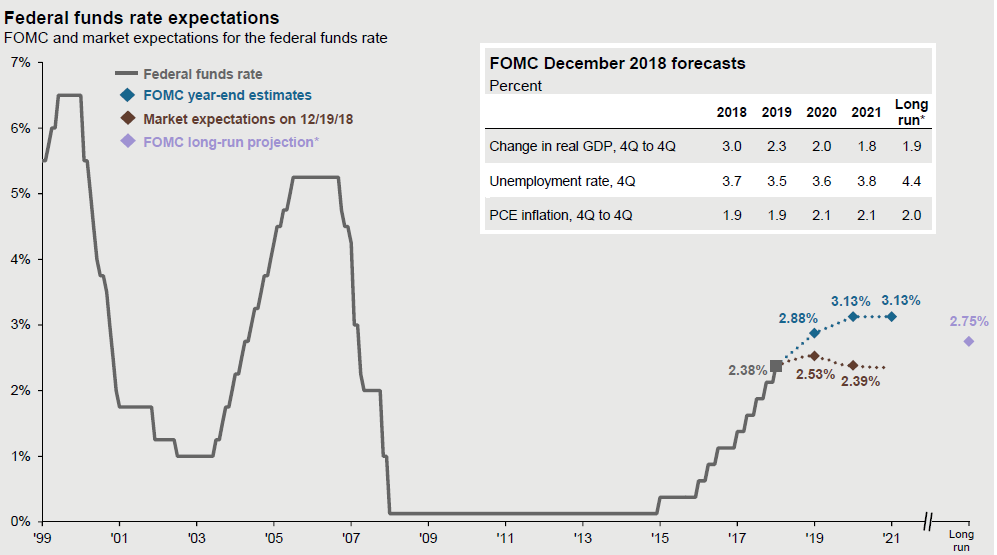
Source: Bloomberg, FactSet, Federal Reserve, J.P. Morgan Asset Management. Guide to the Markets – U.S. Data are as of December 31, 2018.
Debt
We are spending HALF of our government income on entitlement programs and all that goes with it. Our debt was at least at a 0% rate for much of a decade but now that we have much higher interest rates the payment on the debt is becoming something unsustainable. We have to borrow about 22% of our budget just to keep up with the spending. The only way to ever deal with this is to face entitlements head on but that is such an unpleasant conversation there is no one willing to address it. Any politician who does will likely just never win another election. So this is going to be a real problem.
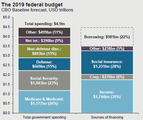
Source: Congressional Budget Office, J.P. Morgan Asset Management Guide to the Markets – U.S. Data are as of December 31, 2018.
Tariffs, China and the Global Economy
Global markets had an extremely tough year. Our strong dollar wacked emerging markets in their growth and any investment in foreign currency killed you. Many of our Caissa portfolios were underweight international in 2018 (as compared to their portfolio targets) even though they had a stellar year before. International markets ended up down 13% or worse if converting currency.
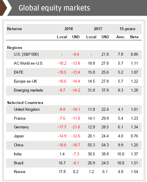
Source: FactSet, Federal Reserve, MSCI, Standard & Poor’s, J.P. Morgan Asset Management. Guide to the Markets – U.S. Data are as of December 31, 2018.
This is where we start to get interested. While the stock market in the U.S. is a little undervalued, the global markets are running very low P/Es. We are looking at potentially increasing our international exposure to try to capture the upswing on the backside.

Source: FactSet, MSCI, Standard & Poor’s, J.P. Morgan Asset Management. Guide to the Markets – U.S. Data are as of December 31, 2018.
China
This is one of my favorite graphs about China. For years they have been trying to force a consumer driven economy and most of those years have failed, only to end up injecting a ton of their own sovereign liquidity into the economy. In the U.S., about 70% of our growth is driven by the consumer and very little by the government. In China it’s much different, if the government (in purple) didn’t inject their own money into the market every year the economy would tumble. They just don’t have the consumer driving like we do.
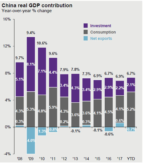
Source: FactSet, J.P. Morgan Asset Management; CEIC Guide to the Markets – U.S. Data are as of December 31, 2018.
Perhaps they will though? If you look at forward estimates of where the middle class will grow the most in the next 10 years, look no further than China and India. Perhaps a consumer-driven economy will emerge from there!
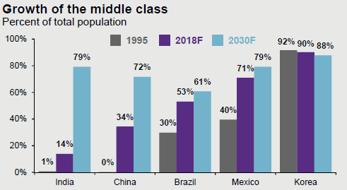
Source: J.P. Morgan Asset Management; Brookings Institute. Guide to the Markets – U.S. Data are as of December 31, 2018.