Investment Update: Chart of the Month
Investment Update: Chart of the Month
Written by Kelly S. Olson Pedersen, CFP®, CDFA
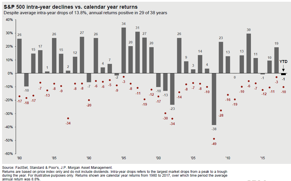
Putting market drops in perspective
The chart below shows the annual return compared to the average intra-year drop (or largest market drops from peak to trough) for each year from 1980 to 2017. For example, last year the S&P ended up 19%, but at some point in the year the market had dropped 3%. In 2016, the market ended up 10%, but at some point in the year it was down 11%. So far this year, the S&P is down about 1%, but we have had a 10% drop from the peak in January until now.
What this chart tells us is that on average for nearly four decades, the market drops about 14% at some point each year. Much of the time, the market ends up higher for the year. In fact for 29 of the last 38 years, the market has been positive for the year despite these double digit dips.
What does this mean for your portfolio? If you can stomach the 14% dips and invest during them instead of selling, your portfolio will thank you in the long term. Going forward, we are planning for a lot more of these dips. We have already seen a 10% dip this year and we could likely rebound only to do it again. However, it does prove that if you have a good plan to get you through the volatility, you will likely come out ahead. So have a plan, stick to it, and keep calm.
